
We needed more space to paint furniture, which my parents' house provides. We also needed some space to practice our home improvement skills. You know, when it's not our house we're practicing on. Besides, my parents are semi-retired and rarely in Charlotte anyway, so they won't notice, right? Seriously, though, everyone knows it's not the right time to sell a slightly outdated house, so we're hoping to be the best renters ever and make much-needed improvements to the house while my parents wait for the market to improve. We will be honored to have you come along with us on this journey of transforming a classically 1990's house (complete with a Vanilla Ice poster in my brother's room) into a home fit for a more 21st Century pop princess (for example, 30-year-old Britney instead of "Baby One More Time" Britney.) You get it.
The first room my sister and I tackled (over my mom's objections) was the dining room. I'll let the pictures tell the story -


Here's a close-up of the wallpaper, in case the magnolias weren't obvious enough -

At last, the AFTER pictures - it's a room you can eat in without stirrup pants now! No perms required! (Note: in 1991, when this room was first decorated, both my sister and I had spiral perms. We were hot.)

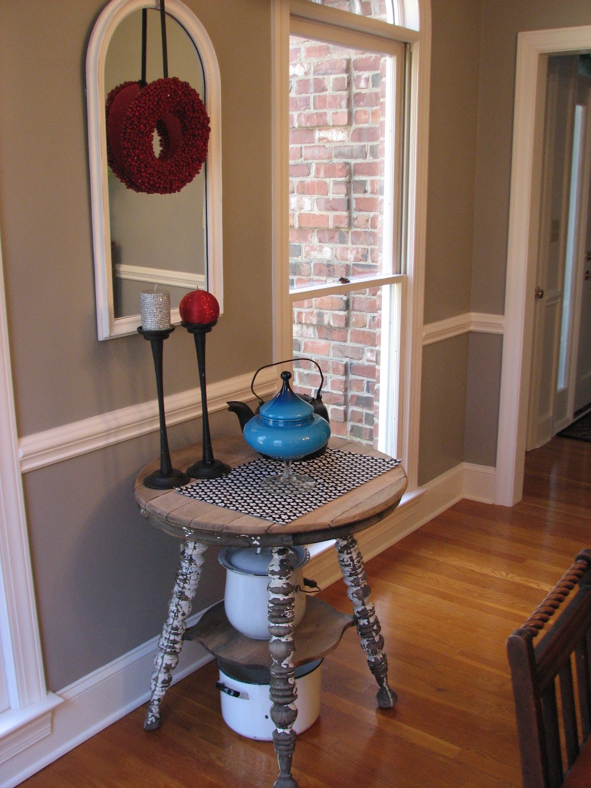


Also, astute readers of Dumped and Discovered will note that we replaced the more traditional buffet with the one that we just painted - lovely! Nothing like a new paint job to make you want to replace all the furniture in a room, right?
One question for you lovely readers - we are having a battle with my mom about whether or not to take the "inserts" out of the windows. We took them out for these photos, but it turns out my mother is rather attached to them. What do you think? Inserts or no inserts?
Happy Junkin'!
Sarah
My vote probably doesn't count, because I helped you take the inserts out, but NO INSERTS! It looks so much more modern without them! (No offense, Mom and Dad.) I love, love, love the dining room now and can't wait to tackle more rooms with you!
ReplyDeletewhat a wonderful change you wrought here
ReplyDelete(sorry
i do love a little alliteration!)
you took your dining space
from 1986 to 2WOW
well done!
alison
Wow - what a difference a decade makes! I would say no to inserts. Your Mom and Dad are good sports aren't they Sarah? Lucky you and lucky them to have you working on the house!
ReplyDeletePeggy
Thank you, ladies! So far... No inserts is winning! Peggy - My parents are VERY good sports! It has been interesting as we try to mold both of our styles together! Thanks for following us as we embark on this journey!
ReplyDeleteNO inserts!!! (I'm fighting that same battle with my Dad... Mom wants them gone too).
ReplyDeleteThe room looks terrific!
I am loving your blog, and your creativity! Not sure how I ended up here, but I am your latest follower.
ReplyDeleteI love the inserts... and I'm 24 (for perspective!)
ReplyDeleteWow! I just found your blog. Love everything you do. I use to live in Davis Lake in Charlotte. So another pleasant surprise to see that you are in NC.
ReplyDeleteI would put the inserts in for another layer of interest. More white!
Blessings yall!
Shelley
It looks awesome!!! And I love modern, but I think I'd be interested to see the new room with the inserts... just sayin ;)
ReplyDeleteRecently discovered your blog & I'm so loving all your amazing transformations! Just featured you today as the recipient of the Liebster Award on Summit Street Joy - come check it out & pass it on ;)
Looks great. So happy to find another blogger who sells at Sleepy Poet. I vote for no inserts. Looks more crisp and updated.
ReplyDeleteGreat job de-brassifying. And wonderful furniture transformations. I'm awarding you with the Blog On Fire award. The post will be up this evening.
ReplyDeletehttp://unclutteredlifestyle.blogspot.com/
great do-over! But I think the inserts would add some architectural interest. Since the walls are now plain.....
ReplyDeleteSarah, Love your room makeover and your sense of humor. Kathy, Petticoat Junktion
ReplyDeleteI am sure I fit in the age range of Mom and Dad....I ditched my window grill inserts...I like the clean modern look and cleaning the windows with them....Love your dining room. It will show super when you sell. Much simpler and more modern. Just found your blog and enjoying it....paint on!
ReplyDeleteI like the inserts...a little architectural punch.
ReplyDeleteLorraine
I'm voting for the inserts!
ReplyDeleteI LOVE this room (sorry mom but she wins!)
ReplyDeleteNo inserts. True divided windows/doors would be cool, but not inserts.
ReplyDeleteNo Inserts...but make sure the rest of the house matches too so it looks consistent from the outside
ReplyDeleteThanks for your feedback!! I agree!
DeleteI came over from Apartment Therapy, and vote no inserts too. I love this transformation! And I, too, had a spiral perm in 1991. What were we thinking?!
ReplyDeleteGreat job—the room is so fresh now.
ReplyDeleteI do happen to like the inserts, though, and I think it's because the windows go all the way to the floor. If they didn't, I think it would be distracting, but I like them as an element of the room. (Plus, the only part I'm not fond of—the half circle dividers—is still there, right? So that part must be non-removable? It makes me think that it's another reason why the insert-free windows wouldn't be as "clean" if the top part is still there.)
Also, thanks for getting "Straight Up" stuck in my head now. :P
ReplyDeletePlease...no inserts.
ReplyDeleteThe look without them is much more clean and contemporary, and it allows you to see/enjoy the full glory of those enormous windows!
Pretty re-do! Can i ask what color the grey is? It's really perfect. Thanks! - Melanie
ReplyDeleteDitto on the spiral perm. And ditto on no inserts. Great job!
ReplyDeleteLoved your post. What color is on the walls, I've been looking for a nice gray for my dining room
ReplyDeleteI noticed the missing inserts before I read the text and I was thinking you'd replaced windows. My exact thought was that those are the kinds of details that make a huge difference. No inserts.
ReplyDeleteIf the above comments don't help with the decision, how about inserts on the top half and not on the bottom? That's the way divided light double-hung windows were done in many older houses. It resolves the worst problem with the inserts, that pesky problem of the chair rail being a horizontal line that competes with and doesn't align with the inserts.
ReplyDeleteI love your work and NO Incerts it changes the entire mood you are trying to create.
ReplyDeletePlease let me adopt you and your sister! You can come here, get rid of my brass, paint my furniture, take out my window inserts and thrift till the cows come home. I'll feed you and watch!
ReplyDelete~Bliss~
BlissRanch.blogspot.com
I know that Apartment Therapy doesn't always let you know when they feature you, so I wanted to make sure you know this made it onto their site. Congrats!
ReplyDeletehttp://www.apartmenttherapy.com/before-after-from-1991-to-21st-164283
...it's just different, no better. Could have removed the border easy enough.
ReplyDeleteThe inserts were lovely, classic and timeless as were the oversize plants. The gray walls are dull. The awful little table with clashing accessories and what looks like a chamber pot underneath it is hideous.Your poor mother...
ReplyDeleteVote for the inserts. Nice contrast with the new
ReplyDeleteY'all did a really good job of updating the dining room. I'm so lovin' the references to yesteryear...made me smile and brought back memories.
ReplyDeleteHmmmm, the inserts are very traditional...could add some older home "character" to the dining room. I'd have to see them in place with the new design to make up my mind.
Sharon
Love the word De-Brassify, that's a keeper. I was just looking at my dining room chandlier it is of course Brass, from the same decade (moved in our new home in August) and it needs some black to bring it up to date like yours. Your space looks great. Amazing what a can of paint can do.
ReplyDeleteI'm old and decrepit, envy your energy to 'update' but I have always wanted the small pane windows ... this is a vote for the inserts ... but understand if they go (I also came across from Apt Therapy, in fact just to see if the beautiful arches were removed from above the windows !!)
ReplyDelete